The Guardian according to Gyford
June 10, 2010
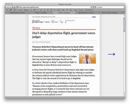
 UK-based creative technologist, Phil Gyford, has neatly interrogated the Guardian's API to create a stripped back version of what an online news experience could be like: Today's Guardian. The readability is enhanced by a layout which is quite similar to that achieved by hitting Safari's new Reader button, and a sense of 'completion' (or percentage thereof) is shown by Tufte's Sparklines at the top. Of course it lacks colour and movement, but who's missing that?
Needless to say, this fits nicely into an iPad's ideal column reading width. Phil hasn't thrown in swiping yet but the one touch on the left and right columns make it pretty zippy on the pad anyway. This kind of site isn't going to suit everyone - but it is going to suit a hell of a lot of people I expect.
More commentary from the designer the rationale here: Today's Guardian (Phil Gyford's website)